Create Search-Friendly Visuals Without a Full Design Team
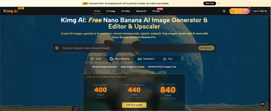
An SEO article may be well researched and properly optimized, yet still look unfinished when its visuals feel generic or unrelated. Small teams often solve this problem with the same stock photos used across hundreds of sites. Others spend too much time asking a designer for every banner, comparison image, or social card. A practical middle path is to create a limited set of visuals around the page’s actual search intent. Nano Banana on Kimg AI supports image generation and photo transformation through written prompts, so marketers can start from either an idea or a source image. The useful goal is not to fill every section with decoration. It is to create images that clarify the topic, support the page, and remain consistent.
Match the Image to the Search Intent
The first visual should reinforce what the visitor expected to find. A person searching for “how to choose a standing desk” needs a different image from someone searching for “best standing desk setup ideas.” The first query suggests comparison or decision support. The second suggests examples and inspiration.
Before generating anything, write the main query at the top of your content brief. Under it, note what the reader wants to do: learn, compare, buy, troubleshoot, or find ideas. Then define one visual that supports that action. A troubleshooting page might need a clear before-and-after scene. A comparison page might benefit from two distinct setups shown under similar conditions. This step prevents a common SEO mistake: using an attractive hero image that has little connection to the page’s actual promise.
Plan Three Visual Roles Before Production
Most pages do not need a large image collection. Three clear roles often cover the essential needs: attention, explanation, and distribution. Planning these roles before generation keeps the visuals connected and reduces unnecessary revisions.
1. Create an Accurate Hero Image
The hero image should communicate the page topic within a few seconds. Keep the main subject obvious and avoid crowded backgrounds. For an article about home coffee photography, a useful brief might request a cup, a phone camera, natural window light, and open space for a headline. Do not ask for every related object, such as beans, grinders, notebooks, plants, and kitchen tools. Extra objects may make the scene prettier while weakening the topic. Review the image at thumbnail size because search and social previews often display it much smaller than the page header.
2. Add One Explanatory Visual
Choose the part of the article that readers may struggle to imagine. A guide about product-page photography could show the same object against a distracting background and a simpler background. A local SEO article could illustrate a shop owner photographing a storefront from a clear angle. When using Nano Banana AI, you can upload a source photo, describe the requested change, and select a model according to Kimg AI’s published workflow. This makes it possible to preserve the main subject while testing a cleaner setting or a different visual style.
3. Prepare a Distribution Version
The article image and the social image should feel related, but they do not need identical framing. A social card may require a closer crop, a stronger focal point, and empty space for text. Create this version from the same subject and style instead of starting with a new visual direction. For example, keep the same coffee cup, table, and lighting while moving the cup to one side. This gives a marketer space for a headline without covering the product. Consistency helps readers recognize that the social post and landing page belong together.
Write Prompts Like Content Briefs
SEO teams already know how to write briefs. The same skill works for image prompts. A useful prompt identifies the subject, intended use, composition, setting, and constraints. It avoids long strings of praise words that are difficult to evaluate.
For example: “Create a wide editorial image for an article about photographing handmade products. Show a small business owner taking a phone photo of a ceramic mug beside a window. Keep the table simple and leave clear space on the right for a title. No visible brand logos.” Every instruction connects to a visible result. If the output feels too busy, revise the background instruction rather than adding more adjectives. Treat the prompt as a working brief that can be tested and improved, not as a one-time creative performance.
Keep Image Sets Consistent Across a Topic Cluster
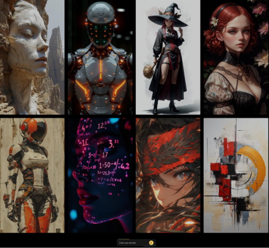
A topic cluster often includes one broad guide and several supporting pages. If every page uses a different style, the group feels disconnected. Choose a few stable visual rules for the cluster, such as natural lighting, simple backgrounds, similar camera distance, and one illustration or photography style.
Imagine a cluster about email marketing for small businesses. The pillar page may show a shop owner planning a campaign. Supporting pages may show a welcome email, a product announcement, and a re-engagement message. Keep the same type of workspace, color mood, and character appearance while changing the task. Kimg AI states that Nano Banana supports up to four reference images, which can help when identity or style continuity matters. Use references carefully, and give each one a clear purpose rather than uploading several unrelated examples.
Review Visuals for SEO Page Quality
An image should pass more than an aesthetic check. Ask whether it represents the topic accurately, whether the focal point remains clear on mobile, and whether the composition leaves room for the page layout. Also look for visual claims that the article does not support. A dramatic graph, award badge, or fake interface may suggest data or features that are not actually discussed.
Create a short review list for your team: topic match, clear subject, mobile crop, text-safe space, brand consistency, and no misleading details. Then preview the image inside the draft page instead of approving it in isolation. A banner that looks balanced alone may conflict with the title, navigation, or call-to-action once placed on the site. Page context is the final test.
Avoid Producing Images Only to Increase Count
More images do not automatically improve a page. A decorative picture after every few paragraphs can interrupt reading and make the article feel padded. Use a visual when it explains, compares, demonstrates, or helps the page travel through another channel.
For a 1,500-word tutorial, a hero image and two explanatory visuals may be enough. If a section is already clear in text, let the text do its job. Spend the saved time improving captions, file names, placement, and surrounding copy. The image generation step should support the page plan, not create extra work for editors. A smaller set of relevant visuals is easier to keep consistent and easier to update when the article changes.
Conclusion
Search-friendly visual production begins with intent, not decoration. Match the hero image to the reader’s goal, give each additional visual a defined role, and write prompts with the same clarity used in a content brief. Keep related pages visually connected, review every image inside the actual layout, and remove visuals that do not explain or support anything. This process helps small SEO teams produce useful page assets without turning every article into a major design request. Pick one existing page with weak stock imagery, define its three visual roles, and replace only the image that matters most first. A focused improvement is more valuable than a large collection of unrelated graphics.