How Content Marketers Are Using AI Image Tools to Create Visual Content for SEO and Social Sharing
Content containing infographics earns roughly three times more backlinks than text-only pages covering the same topic, and visual content gets shared on social media at a rate dramatically higher than text alone. An AI Image Generator, the one available in Higgsfield is becoming part of how content marketers produce that kind of visual content without a dedicated design team behind every piece.
Why Does Visual Content Still Matter for SEO and Backlink Acquisition in 2026?
Infographics and visual content remain among the most reliable formats for earning inbound links, with multiple 2026 industry analyses putting infographic-rich pages at 3 to 3.4 times more backlinks than comparable text-only content. Visual content also gets shared roughly three times more often on social platforms than text, and that early social distribution genuinely helps, higher initial referral traffic signals relevance to search engines and exposes content to more potential linkers organically.
This matters especially given how competitive most content marketing niches have become. When two pieces cover the same topic with comparable research depth, the one presented as a genuinely well-designed visual asset consistently has an edge in getting noticed, shared, and eventually linked to, simply because it’s easier for a busy reader or fellow content creator to actually process and remember.
What Actually Makes an Infographic Earn Backlinks, Not Just Views?
This is the distinction that actually matters, and it’s more specific than most general marketing advice suggests. Data-driven infographics built on original research consistently earn the most backlinks because they create genuine citation dependency, other publishers have to link back to reference the actual data they’re using. A visually polished infographic built around recycled, already-published statistics doesn’t create that same dependency, since anyone citing that data can just as easily link to the original source instead.
This is worth sitting with for a moment, since it runs somewhat against the intuitive assumption that better design alone should earn more links. A modest-looking chart built on a genuinely original 500-person survey will consistently outperform a beautifully designed infographic summarizing statistics everyone’s already seen from three other sources. The data is the actual asset. The design is what makes that asset legible and shareable, but it isn’t what creates the underlying reason to link.
Why Have Infographics Stopped Delivering the “Easy” SEO Wins They Once Did?
Worth being direct about this, since an SEO-literate audience will see through an oversold pitch immediately. The low-effort syndication that made infographics an easy, near-automatic link magnet between roughly 2012 and 2016 has genuinely declined, image-only content now needs specific optimization to perform in image search, and changing user habits mean a static visual increasingly needs to answer a query directly to compete with short video and interactive formats.
That earlier era produced a lot of genuinely low-quality output, generic infographics assembled quickly and syndicated widely purely to farm links, with little regard for whether the content actually said anything new. Search engines and publishers alike have gotten meaningfully better at recognizing that pattern, which is exactly why the format’s easy wins have dried up while genuinely well-researched, original visual content continues to perform strongly.
What Happens When Visual Content Looks Polished but Has No Real Data Behind It?
This is a real, common trap. A genuinely well-designed infographic with no original data behind it might still perform reasonably on social shares, since visual content generally outperforms text there regardless of substance, but it won’t create the citation dependency that actually drives backlinks. Polish alone was never really what earned links, the underlying data always was, and that’s become even more true as the format has matured past its earlier, lower-effort era.
The gap between social performance and backlink performance is worth understanding clearly here, since they’re driven by genuinely different mechanisms. A visually appealing graphic can rack up likes and shares based purely on how it looks, satisfying the platform-level engagement metrics a social team might be tracking. But a fellow content creator deciding whether to actually cite and link to that graphic in their own published work is asking a different question entirely, does this contain something I can’t get anywhere else. Only genuinely original data answers that question well.
What Are the Traditional Options for Producing SEO-Focused Visual Content?
Hiring a dedicated designer or agency remains the strongest traditional option for a flagship data visualization or campaign asset. Template-based design tools are the more accessible alternative, genuinely useful for quick social graphics but often producing a look that’s hard to distinguish from countless other infographics built from the same template library, a real risk given how many content teams reach for the exact same popular tools.
Where Does Manual Design Fall Short for a Content Marketer Producing Regular Visual Content?
The constraint is volume relative to how much visual content a genuinely active content marketing program actually needs. A single flagship infographic built around real survey data might justify a proper design engagement. A content marketer needing supporting visuals for a dozen articles a month, social graphics, comparison charts, embeddable summaries, faces a volume problem manual design or a design queue struggles to keep pace with.
This constraint tends to bite hardest for smaller, leaner content teams, exactly the teams that most need visual content’s outsized backlink and social performance to compensate for not having a large existing audience or domain authority already working in their favor. The teams with the most to gain from strong visual content are often the same teams with the least design capacity to produce it consistently.
| Hiring a designer or agency | Template-based design tools | AI Image Generator | |
| Cost | A real per-project fee | Subscription, affordable | Included in one subscription |
| Distinctiveness | High, if properly briefed | Limited, shared templates | High, built around your actual data |
| Turnaround | Days to weeks | Fast, but generic-looking | Minutes |
| Best suited for | A flagship data visualization | Quick, lower-stakes social posts | Ongoing visual content across many pieces |
How Does an AI Image Generator Fit Into a Content Marketer’s Actual Workflow?
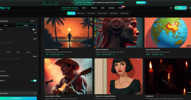
Higgsfield gives a content marketer access to more than 15 leading image models, including Nano Banana Pro, GPT Image, Seedream, and FLUX, from a single workspace, letting them turn a piece of original research or data they’ve already gathered into a clear, well-designed visual quickly, without a design queue slowing down how many pieces of content can actually get the visual treatment they deserve.
This matters most for a content team running a genuinely active publishing schedule, where the actual research and writing happen on a predictable cadence but the visual production has traditionally been the step most likely to slip or get skipped entirely. Closing that gap means a piece of genuinely strong research doesn’t lose its shot at earning backlinks simply because the accompanying visual never got made in time.
How Do You Keep AI-Produced Visuals From Becoming Empty, Citation-Worthless Graphics?
This deserves direct attention, since it’s exactly where the real value of this approach either holds up or falls apart. An AI Image Generator should be used to visually present data and insight a marketer has genuinely gathered, an original survey, real analysis, a unique comparison, not to manufacture the appearance of a data-driven infographic without any real underlying research behind it. A beautifully designed visual built on nothing new won’t create the citation dependency that actually earns backlinks, regardless of how polished it looks. The tool speeds up production. It doesn’t create the original insight that makes a visual worth linking to in the first place, and treating it as though it could would waste the very time it’s meant to save.
What Can a Content Marketer Actually Produce Beyond a Single Infographic?
Beyond one flagship infographic, the same underlying research can be broken into smaller, platform-specific visual snippets, since different platforms favor different formats and a full infographic broken into highlights often performs better across social channels than the complete piece alone. This kind of multi-format distribution matters for the same reason a solid outreach and distribution strategy matters for any link-building effort, producing genuinely link-worthy content is only half the work, getting it in front of the right audience is the other half. This is worth stating plainly, since Higgsfield is sometimes assumed to be a single-purpose image tool. Higgsfield AI is a native AI creative suite, which offers advanced AI image, video, and voice generation, editing, and upscaling tools. This means a content marketer can also produce supporting video content from the same workspace.
Does This Replace the Research and Data-Gathering That Actually Earns Backlinks?
No, and this matters as much here as anywhere. What actually earns backlinks is genuine, original research, a real survey, unique data analysis, an insight nobody else has published yet. An AI Image Generator, whether Higgsfield or a comparable platform, speeds up turning that research into something visually compelling. It does not gather the data, run the survey, or produce the original insight that makes a piece of content worth citing in the first place. That research work stays entirely the marketer’s own.
What Should a Content Marketer Look for in an AI Image Generator?
A few things matter more here than for general creative content. The ability to accurately visualize real data, charts, comparisons, statistics, matters more than decorative styling, since accuracy is what actually earns the backlinks this content is meant to attract. Fast turnaround matters given how much regular content marketing programs need to produce. And the ability to reformat one core visual across different platform-specific dimensions matters practically, since distribution increasingly depends on format-native content, not one-size-fits-all graphics uploaded identically everywhere.
What Are the Key Takeaways for Content Marketers Producing Visual SEO Content?
- Infographics and visual content remain genuinely effective for backlink acquisition and social sharing in 2026, but the easy, automatic wins of the format’s earlier era have declined significantly.
- Original data creates citation dependency, which is what actually earns backlinks. Polish and design quality alone, without real underlying research, doesn’t create that same effect, no matter how professional the final graphic looks.
- An AI Image Generator like Higgsfield helps content marketers turn genuinely original research into professional visuals quickly, closing a real production bottleneck for programs needing regular visual content on a limited team.
- The research and data-gathering behind a visual is what actually earns it backlinks. AI tools speed up production; they don’t create the original insight that makes content worth citing in the first place.
What Are Some Frequently Asked Questions About AI Image Tools for SEO Content?
Will an AI-generated infographic earn backlinks even without original data behind it?
Generally no, or at least not reliably. The research is consistent that citation-worthy backlinks come from original data creating a genuine reason for other publishers to link back, not from visual polish alone, regardless of which tool or platform actually produced the final graphic.
Is it still worth investing in infographics for SEO in 2026, given the format has matured?
Yes, provided the content is built around genuinely original data or insight rather than recycled statistics. The format’s easy, low-effort wins have declined, but well-researched visual content still performs meaningfully better than text-only content for both backlinks and social sharing, and that gap doesn’t look likely to close anytime soon given how much competing content still leans on recycled statistics dressed up in a nicer template.
Do I need design experience to create SEO-focused visuals this way?
No. Describing the data and visual style you need in plain language is enough to produce a usable result without formal design training, which matters given how many content marketers have strong research and writing skills but limited hands-on design experience.
How does this fit alongside template-based design tools I already use for social graphics?
They can work well together. Template tools remain efficient for high-volume, lower-stakes social content, while an AI Image Generator working from your actual research tends to produce more distinctive, citation-worthy results for the flagship pieces specifically meant to earn backlinks and drive real referral traffic.
How often should a content marketing program actually produce this kind of visual content?
Consistency matters more than frequency for its own sake. Regular publishing correlates with better cumulative traffic gains, but each piece still needs genuine data behind it to actually earn the backlinks this format is capable of, which means it’s usually better to produce fewer, genuinely well-researched visuals than to hit an arbitrary publishing quota with weaker underlying content that won’t earn the same results regardless of how it’s formatted.